

How User Interface Impacts SEO and Search Engine Rankings?
User Interface Impacts on SEO: Have you ever visited a site that was super slow to load, had a whole bunch of content all over the place or was just plain difficult to navigate? Doesn’t it just drive you crazy? A website that is not well designed is the same as a phone without a touchscreen or a door without a handle – very uncomfortable and not at all inviting.
Every product that we use, whether it is a mobile application, a gadget, or even a common product, has the intention of allowing the user to experience and enjoy it. This is also the case with websites. A website with a simple and welcoming design not only catches the visitors’ attention but also makes them feel like they are the ones in the driver’s seat of the exploration thus leading them to come back again.
UI and UX that is outstanding is not only about the looks—they do SEO as well. Google does not rank the web pages by taking into consideration the keywords alone; it also pays attention to the user’s experience signal from metrics like page load time, mobile friendliness, HTTPS, and layout stability.
The integration of Google’s Page Experience into the ranking algorithm has brought forward the importance of the main elements of UI and UX like the load time, mobile friendliness, and visual stability in the overall performance of the search engine. This paper will thoroughly explore the topic of UI and SEO followed by points on how the former impacts the latter and tips for improving both user experience and search rankings.
Why User Experience and User Interface Are Crucial for SEO Success
It is true that the provision of compelling content and quality services can keep users engaged, but if the website or app is not user-friendly, they will leave anyway. UX through UI must be a rewarding experience for users, and they should struggle with no difficulty—otherwise, it would be very hard for them to interact effectively.
We can take a look at the investment app of Fidelity and see where they have gone wrong. The previous version was so crowded that not a single person could make out a finance-related term since, without logical names for buttons or fields, nobody could tell what they were there for, and very low point size of the font also contributed to this.
One fat and big red “Buy” button at the bottom, stars on the nice stock, etc. Besides that, the topmost part is the company profile for further information. They added a manual for one of the pages: “How to get the most out of this page.” Thus, it is now possible to find, buy, and sell stocks in a way that does not require users to change their interaction with the stock market.
Fidelity app redesign for the new, less-experienced investors requirement was made possible through the app’s more intuitive and user-friendly features. Consequently, trading became a lot easier, thus it was a more appealing product and became a leader in the broadening investment world.
The Relationship Between UI and SEO
Web design and easy navigation of the website can affect SEO either in a positive or a negative way. Besides keywords, SEO includes backlinks and also the real visitors’ signal, therefore the search engines like Google pay attention to it. User behavior factors such as time spent on site or the percentage of users who will return are critical on-page metrics.
For example, if a visitor leaves within just a few moments of landing on a particular webpage of your site, the search engine will consider this to mean the page is not serving its expected purpose of being useful or engaging enough. This, too, besides being a high bounce rate, could have been caused by some of the following: bad UI (hard-to-navigate place as they are unpleasantly laid out, so visitors have to search for the things they need), and/or the words used are not familiar. Low user-engagement and high bounce rates can adversely affect search engine ranking, even though your content is of excellent quality.
The introduction of an attractive UI stimulates the visitor to view more pages, hang around the site much longer, and respond to call-to-action in a way that is not only fun but also simple. Not only does this lead to user satisfaction, but it also sends a signal to the search engines that your website is valuable and pertinent.
Google’s Core Web Vitals, besides confirming the close relationship between UI and SEO, also show the improvement the numbers achieve for:
- Loading speed (Largest Contentful Paint – LCP): The first time the major content can be seen and how long it takes to be shown.
- Interactivity (First Input Delay – FID): The delay in the reaction to the user’s first interaction – clicks or taps.
- Visual stability (Cumulative Layout Shift – CLS): The degree to which the visual elements shake while the page is loading.
A smoother and more continuous experience is what users find with the websites adapted to their Core Web Vitals which include less choppiness, less interruption, and faster loading, and search engines duly take notice of it by way of ranking. So turning up the characteristics of the interface can mean not only friendly interaction for visitors but also a good-by association with SEO through these signals.
Website UI/UX Enhancements Towards SEO
Depending upon, and being dependent on something, sometimes some SEO guys tend to get them mixed up. User Interaction and User Engagement aim at developing a site that engages the visitor so much on a certain page that he is forced to visit your site and interact with some major elements on it.
So, with that in mind, here are some points to make your SEO benefit from great UX/UI.
1. Website Speed
The user usually absorbs a lot of expectations when entering a new site, and it hardly ever loads, but a site does whatever in an instant; it gives joy to navigate through it. Most users simply will not wait for that long. Fundamentally, site speed can make or break great experiences; a slow loading page only disturbs visitors and big chances they have already bounced away without ever interacting with your content.
Research shows that nearly half of all potential leads will have left the website if it took just over five seconds to load. An ergonomic user interface makes sure that the website is equally fast and that visitors can stay there a little longer and interact with it.
If you notice your website running slowly, there are simple ways to boost speed:
- Use CDN: Employ a content delivery network to make sure that the site is being served by an array of servers that reduce the load time perceived by a user sitting at any point of the globe. Cloudflare offers just such a service.
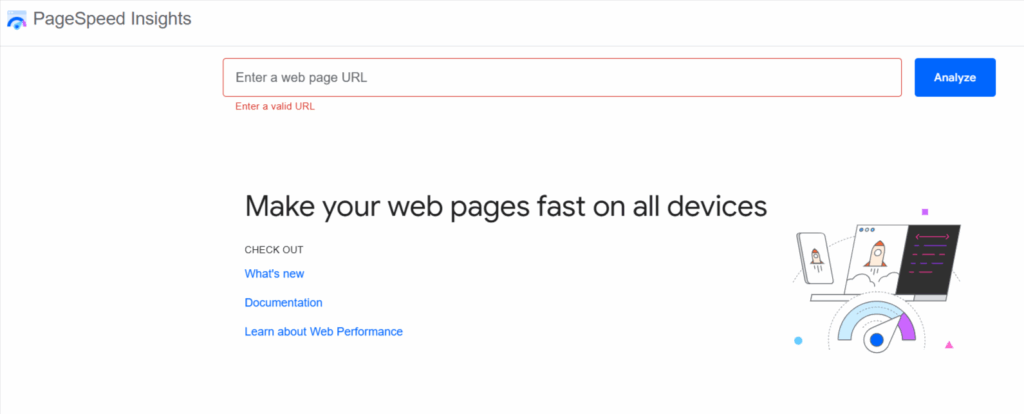
- Measure performance: Google’s PageSpeed Insights will allow you to analyze your site and will also allow you to see in which areas you should work.
- Optimize Images: Compress and reduce their size without compromising on the quality.
- Lazy Loading: These images and other media only load as they’re about to enter a person’s view, thus revitalizing the approach of delaying initial downside loading.
2. Accessibility
The opening point allows room for UI and UX designing with an assurance that any visitor can enter, navigate, and simply enjoy the website. While Web Content Accessibility Guidelines (WCAG) are the world’s standards towards digital content inclusivity, under the whole realm of W3C.
Consider a button with slight purple text, almost appearing to be a mere shade of purple against the backdrop. Such color scheme is sure to draw sporadic glances from the users thus interrupting the users from engaging with the button. Go for high contrasts, where, for example, a white background would be easy for the users to read the text and click on the button.
Accessibility is described by four core principles:
- Perceivable : The content must be presented in a manner so that it can be perceived by at least one human sense. For instance, videos need to have captions, or images need to have alternative text so that a group of users can understand the content conveyed.
- Operability : Every single feature and method should be available for operation by any means. To put it in another way, any complete feature with all its specifications must be operable from the keyboard and, therefore, must never generate any flashing that could lead to a seizure.
- Understandable : Contents and navigation shall be reasonable. Words must be discernible; instructions must be clear; and the user shall be entirely able to predict the interface layout so that the user understands what is being communicated.
- Robust : As technologies become old, at any rate, content should be accessible to the browsers, devices, and assistive technologies available at that aegis of time.
3. Ease of Use
Generally, one big assumption during UI/UX phases is that the easier, the better. A site or an app is always throwing an idea to the user of what he can do and consequently assisting him in performing the task straight away. The more buttons or links bombard a user, the more irritated he ends up in navigating.
Palpitating animations and sizzling graphics put the payahs on the task; they are just ugly. The three-click rule stipulates that any page should take a maximum of three clicks, thus rendering the navigation intuitive and the site well-structured.
Templates provide with ready-made layouts which are easy to use and classy. Custom designing from the scratch is extremely time-consuming and costly, and usually ends up with an interface that looks cluttered.
4. Easy To Read Content
Content is at the heart of every SEO machine; however, SEO will only get traction if the audience can perceive the said content effortlessly into its meaning. Keep content concise, fun, and to the point so that visitors will be able to stay for a little longer, resulting in a better user experience and higher rankings.
Some ways in making readable content are:
- Drafting conversations in a natural tone.
- Mix lengths of simple sentences for rhythm.
- Use white space; it makes the text less dense.
- Make use of headers (H1, H2, H3) to aid structure and scanning.
- Use bullet points, numbered lists, and tables to clarify.
- Complement with images, infographics, or videos for interaction.
5. Mobile Friendly
Any site should really be set up for mobile use; unfortunately, many sites are just not much into the philosophy. The act of chopping off pages, tiny buttons hard to tap, menus that act like they want to hide: Enter these behaviors that just push the mobile user experience down so much that the user just abandons!
Mobile traffic is expected to reach close to the amount of desktop traffic; Google is assessing sites first on mobile: First drafting site ranking mainly on the mobile side. Any site that actually does fine on desktop but is worse on mobile will lose visibility in rankings.
Mobile sites should offer a pleasant experience to their users; hence, the font should scale properly, and all touchpoints should be easily tappable. Easy-to-follow navigation is something that is strictly demanded. In responsive design, a website can rearrange its layout at the very moment it detects that a user is using a smartphone, tablet, or desktop monitors.
Another wonderful tool by Google is the Mobile Friendly Test, which presents a quick report highlighting any mobile usability problem areas for you to fix before they meddle with user experience and rankings. A responsive site will keep visitors glued and push SEO little bit since in today’s world, search engines prioritize sites that provide the best user experience over any device.
Conclusion
UX and UI very big ingredients in SEO depending on whether you’re looking into doing standing SEO, doing it yourself with little marketing tools, or just hiring an SEO company. Those minute factors like simplifying your menu or making your buttons clearer and more obvious or even better organizing your content will really help drive engagement and page performance.
Thankfully today, most of the modern-day tools have taken care of most of the difficulties in doing UX and UI enhancement, without much of coding requirements. No code platforms and readymade templates of “almost no thought” allow businesses and marketers to quickly whip up sites with any level of design funk, thereof, responsiveness, and user-friendliness.
Dualism of focus on design and usability makes the design raster enjoy somewhat more favor from the visitor and also some from SEO, so the pages ranking higher and a ton of visitors coming in. UX and UI have lost the mantle of being any more the building technician; it has become a major part of any building for a site promoting searches and that humans actually want to use.
FAQs
How does UX affect SEO?
Great UX recognizes engagement; it minimizes bounce rates and maximizes on-site time as all of these are signals search engines use to rank pages. Thus, smoother and more intuitive experiences would enhance SEO performance.
What is the 80/20 rule in UX design?
User interaction for 80% comes from 20% of the features. Hence UX designers concentrate on these features to optimize their usability and impact.
What are the 7 golden rules of UI design?
The seven golden rules are consistency, shortcuts, feedback, error prevention, simplicity, control, and forgiveness. They stand for possibilities to make interfaces intuitive and user-friendly.
How UI differs from UX?
UI is the interface through which the user interacts with-website interface, application interface, or any software service interface. It concerns the capable design and layout style that an interface displays. UX, on the other hand, refers to the very user experience of doing something-going toward ease of use and enjoyment of a prospect. UI is visual, and UX is functional and behavioral.
What are the 3C’s in an SEO strategy?
The 3C’s are Content, Code, and Credibility: a way of saying that content should be of high quality, that there should be a clean technical path from the search engines, and that credible judgments should be made in search content evaluation.